Spring suits clear, cool colours - white, cream, pale yellow and soft blue. Summer takes strong saturated colour. Autumn wants bronze, russet and deep purple. Winter runs on evergreen with white, red or silver accents. Two colours plus green in any season.
The same basket of flowers looks quite different in March and October, because the light changes and the surroundings change with it.
Two colours plus green
The rule that holds in every season and does most of the work.
One dominant colour, one supporting colour, and foliage carrying the rest. Every colour available in one basket reads as a jumble in any month, however good the plants are.
Spring: clear and cool
Spring light is bright and clear, and there is very little competing colour in a garden yet.
White, cream, pale yellow, soft blue and clear pink all read beautifully. Heavy oranges and bronzes look out of place against fresh growth - the spring guide covers the plants.
Summer: strong and saturated
Strong summer light bleaches pale colours and washes out subtlety, which is why pastel schemes that looked lovely in May can look faded in July.
Deep pinks, purples, reds and strong blues hold up. A white partner keeps a saturated scheme from looking heavy - the show-stopper guide covers building one.
Autumn: low, warm light
Autumn light is low and golden, and the surroundings shift to browns, russets and yellows.
Bronze, amber, deep purple, cream and dark green sit in that palette naturally. Bright pinks and blues that were right in June suddenly look imported - the autumn plants guide covers the season.
Winter: structure with accents
Very little flowers, so the scheme is foliage with punctuation.
Dark evergreen as the base, then either white and silver for a cool scheme or red and gold for a warm one. Two accent colours at most - the winter range covers displays.
Match the house, not just the season
A red brick house and a white rendered one suit different palettes entirely.
Strong pinks and reds can fight red brick, where whites, blues and yellows lift it. Against white render almost anything works, and against grey render, warm colours do more than cool ones.
Match the door
The front door is the strongest colour on most house fronts, and it is usually right beside the basket.
Either pick it up in the planting or stay clearly away from it. A near-match that is slightly off is the one combination that always looks accidental.
Foliage colour counts
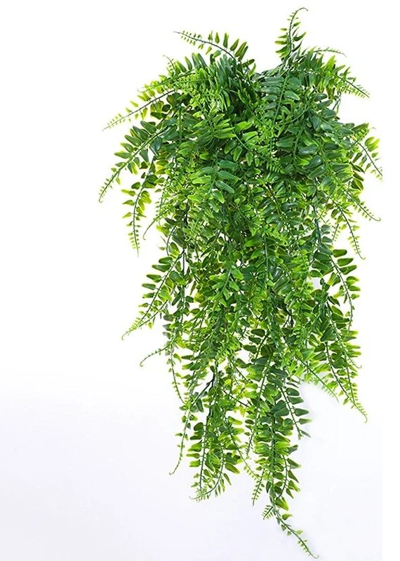
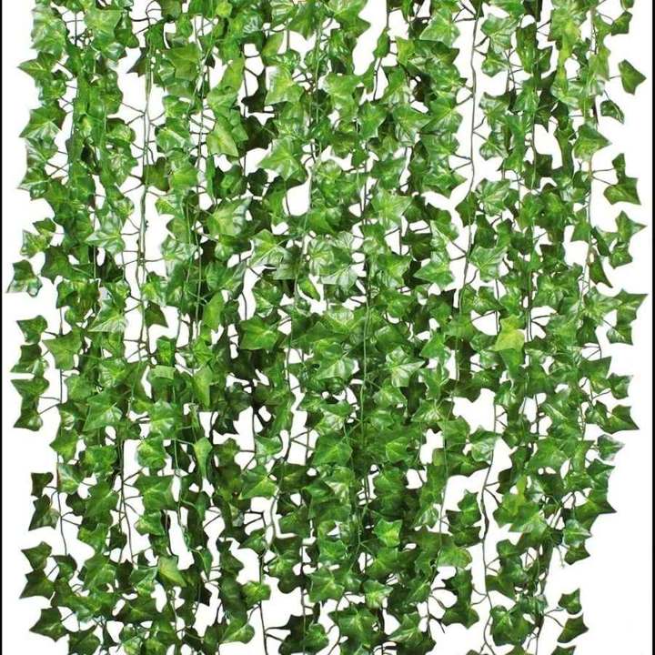
Not all green is the same green, and the foliage is two thirds of the basket.
Silver and grey foliage cools a scheme and lifts a dark corner. Lime and gold warm it. Dark purple foliage makes bright flowers look brighter - the trailing plants guide covers foliage.
White is the safe partner
It works with everything, reads well at dusk when other colours go grey, and stops a strong scheme becoming heavy.
A white-led basket is also the one that reads best in a shaded position, where saturated colours disappear into the gloom.
Colour in shade
Dark positions eat colour. Deep purples and reds vanish into shade, while white, cream, pale pink and lime foliage keep working.
That is a practical constraint rather than a stylistic one - the best plants guide covers what grows there.
One scheme, repeated
Along a run of wall or fence, repeat the same palette rather than varying it basket to basket.
Repetition reads as a design; variation reads as three separate decisions - the wall and fence planting guide covers runs.
Transitional schemes
Choose a palette that works across two seasons and the changeover gets much easier.
Cream, white and dark green carries spring into summer and autumn into winter without looking wrong at either end - which is why it is the palette most public planting uses.
Artificial makes the palette permanent
The one route where the scheme does not drift as flowers come and go.
It also means you can plan a colour change deliberately by swapping accent stems while keeping the foliage base - the seasonal displays guide covers that, and the artificial flowering range covers the stems.
Neighbouring planting counts
A basket is not seen in isolation. It hangs against a wall, above a border, next to a door and near whatever else is planted.
A scheme that works on its own can clash badly with a border directly below it, so choose the basket palette after looking at what is already flowering underneath rather than in a garden centre aisle.
The simplest safe route is to repeat a colour that is already there rather than introduce a new one - the basket range covers the containers.
Where to start
Pick the two colours from what is already there - the door, the brick, the window frames - and let the season decide how strong they should be.
The basket range covers the containers, with free UK delivery over £20.
The short version
- Two colours plus green, in every season - more reads as a jumble.
- Spring light is clear and cool; strong summer light bleaches pastels.
- Autumn's low golden light makes June's pinks and blues look imported.
- A near-match to the front door is the one combination that looks accidental.
- Dark positions eat deep colours - white and lime keep working in shade.
Frequently asked questions
How many colours should a hanging basket have?
Two plus green. One dominant colour, one supporting colour, and foliage carrying the rest. Every colour available in one basket reads as a jumble in any season, however good the plants are.
Why does my summer scheme look wrong in autumn?
Because autumn light is low and golden and the surroundings turn to browns and russets. Bright pinks and blues that were right in June look imported against that, where bronze and deep purple sit naturally.
What colours work in a shady spot?
White, cream, pale pink and lime foliage. Deep purples and reds simply vanish into shade, so a white-led basket is the practical choice for a dark position rather than just a stylistic one.
Should the basket match the front door?
Either pick the door colour up deliberately or stay clearly away from it. A near-match that is slightly off is the one combination that always reads as accidental rather than chosen.
Is there a palette that works all year?
Cream, white and dark green carries spring into summer and autumn into winter without looking wrong at either end, which is why most public planting uses it. It makes the seasonal changeover far easier.